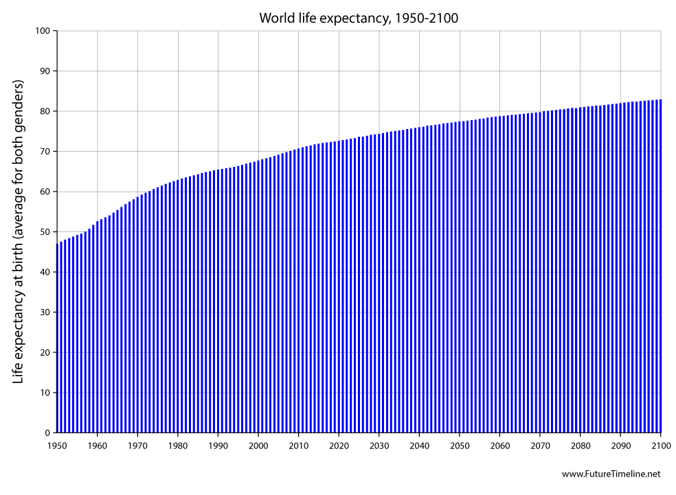
World life expectancy, 1950-2100 This graph shows worldwide life expectancy at birth, averaged for both genders and all nations, from 1950 to 2100 under a UN "medium" variant scenario. Landmarks include the ages of 50 (1957), 60 (1973), 70 (2008) and 80 (2072). There is considerable variation between countries. This graph is simply the global average. The future projection is based on current trends – ignoring potential disruptions, or radical medical breakthroughs such as a cure for aging.
Click to enlarge
Sources: United Nations Population Division – World Population Prospects 2017 World Bank – Life expectancy at birth, total (years) Our World In Data – Life expectancy
Posted: 8th July 2018. Last updated: 8th July 2018.
If you enjoy our content, please consider sharing it:
|


